ShopDreamUp AI ArtDreamUp
Deviation Actions


Description
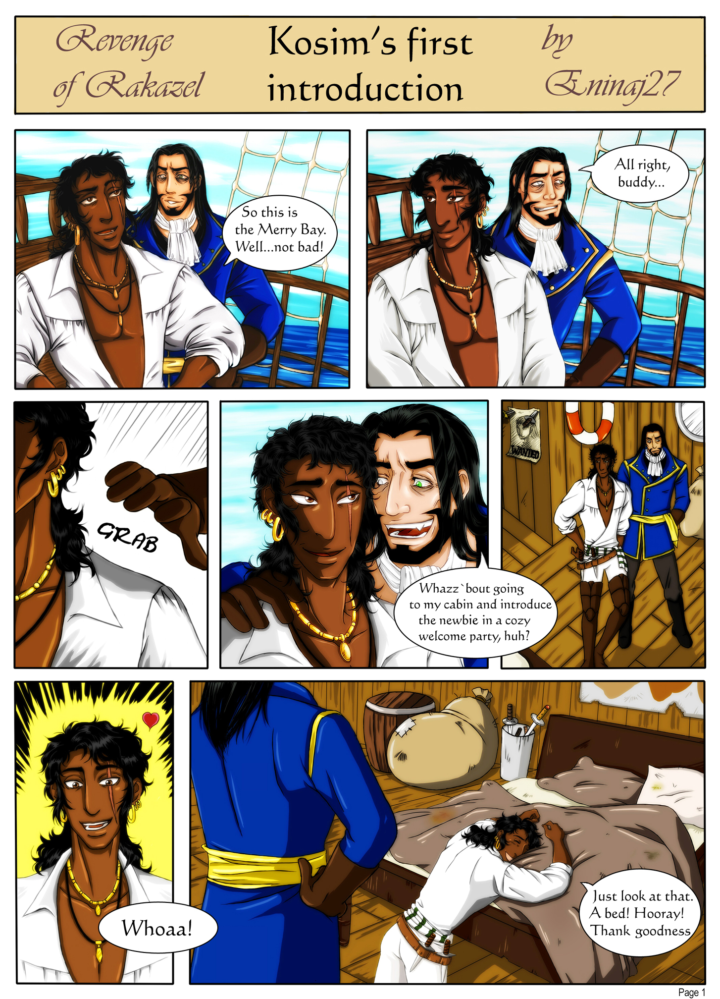
This is the first page of a short comic with Kosim and Raoul. (And my very first colored comic)
It's a little funny part from the main story of Revenge of Rakazel.
My perspective skills suck! I hope I will become better soon XD
The Merry Bay is capt'n Raoul's pirate ship. After having a lot of bad luck Kosim is very happy to visit a ship again. But Raoul's way of celebrate a newcomer will be kinda special.
Kosim isn't really a crew member of the Merry Bay. Balbaris, the capt'n of the Rakazel pirates, rescued the poor guy from a cage near the desert dungeon and recruited him.
OC Kosim and Raoul belongs to our story Revenge of Rakazel
PLEASE WATCH IT BIGGER SIZE
Page 2 is here: [link]
Image size
1454x2016px 1.79 MB
© 2012 - 2024 Eninaj27
Comments16
Join the community to add your comment. Already a deviant? Log In
You were asking for critique in #Critoons so I thought I'd point few things out.
The overall expression the page gives is quite good - no disturbing white spaces, the colors are balanced and there's enough contrast to make it look deep. That's probably what attracts the reader's attention first; it's rare to see such saturated color choices in a comic pages. That's not bad, it can get disturbing if you're not careful enough but you've done well here in my opinion. Just remember to keep the realism in check - the sea's almost too blue. Though if it's a deliberate stylistic choice then just ignore me.
My main point of critique would be perspective. Someone may have pointed it out already, but anyway in panel 5 there's a different angle to the background and the persons - if this were 3D they would be leaning backwards in a rather odd way. The same in the last panel, though not to such extent; the background's perspective is fine but the dude seems to be sinking in the floor a little.
Do you just sketch the angles by hand without 3D programs, guiding lines etc? This is what it looks like to me. It's fine as long as you keep the perspective relatively simple but sooner or later you'll run into troubles when it comes to taking your comic-making to the next level. Some use 3D programs, I myself prefer using the 1/2/3 point perspective technique by hand. Here [link] is a pretty nice guide. You're probably familiar with the technique already though so if I'm just repeating the obvious please ignore me again. c:
Anyways the point is that be careful that the people are in synch with the background when it comes to perspective. It's not way too disturbing here, some might ignore it, but as I'm pretty strict about stuff like that I noticed it almost instantly and it kept bothering me throughout the page. By fixing it this page would look very professional already.
And a minor comment about the clothes - it's not like I've ever read your comics before, just saw this in the #Critoons gallery, but in general I've understood that pirates aren't the cleanest people around and that considered their clothes look suspiciously clean here. I mean, that white shirt wouldn't stay white for an hour. But, yeah, it comes down to style again to some extent I guess, just thought I'd point that out.
And which time period is it? Were there really those red-and-white life rings at the time? Details details I know, but they're important in a comic. They make it look more realistic.
I'm resisting the urge to throw some plz sparkles here.
Apart from these there are a million good things about the page, but listing those isn't the purpose of a critique I guess so I'll just leave it at that. Hopefully this is of some help, we all want to develop & improve in the end.
I'm sure this comment looks so strange among the other comments.